Plot Types
Several unique 2D and 3D plot types can be created, modified, and displayed
with Grapher.
|
|
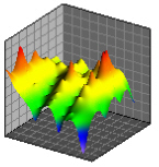
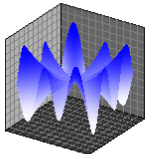
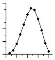
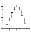
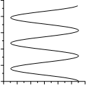
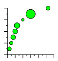
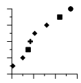
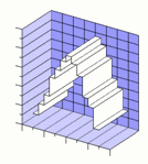
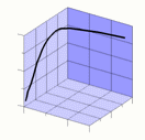
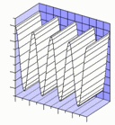
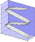
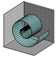
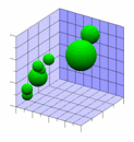
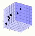
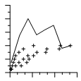
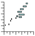
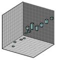
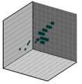
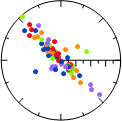
Basic PlotsBasic plots include 2D line plots, scatter plots, line/scatter plots, step plots, function plots, bubble plots, and class plots. In most cases, two variables are displayed on two axes. The Basic plots also include 3D ribbon plots, 3D wall plots, 3D step plots, and 3D function plots. In these cases, two variables are displayed with a 3D view. Basic plots also include XYZ line/scatter plot, bubble plots, and class plots. These are true three-dimensional plots, using at least three variables and three axes. |
|
|
|
|
|
|
|
|
|
|
|
|
|
|
|
|
|
|
|
|
|
|
|
|
|
|
|
|
|
|
|
|
|
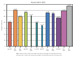
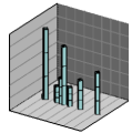
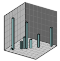
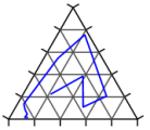
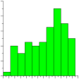
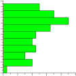
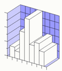
Bar PlotsBar plots include 2D, 3D, or XYZ horizontal and vertical bar charts and floating bar charts. For 2D bar charts, two variables are displayed on two axes. For 3D bar charts, two variables are displayed with a 3D aspect. 2D and 3D bar charts can also be created directly from category data. XYZ bar charts are true three-dimensional bar charts, where three variables are displayed on three axes. |
|
|
|
|
|
|
|
|
|
|
|
|
|
|
|
|
|
|
|
|
|
|

|
|
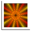
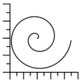
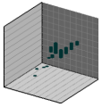
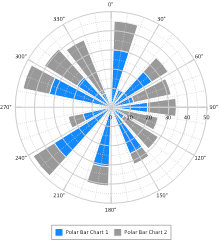
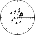
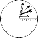
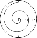
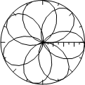
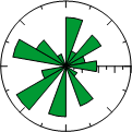
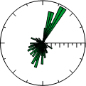
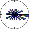
Polar PlotsPolar plots include polar line plots, scatter plots, line/scatter plots, class plots, vector plots, function plots, bar charts, rose charts, wind charts, and radar charts. Data are positioned on a circular plot at an angle and a specified distance away from the center location. Rose charts are histograms where data are binned by angle value. Wind charts are similar to rose charts but the data in the bins is further categorized by a second variable. Radar charts represent multi-variate data on equi-angular spokes, or radii. |
|
|
|
|
|
|
|
|
|
|
|
|
|
|
|
|
|
|
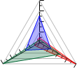
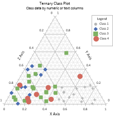
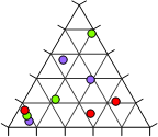
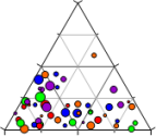
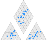
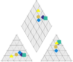
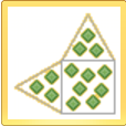
Ternary PlotsTernary plots include ternary scatter, line/scatter, line, class, and bubble plots. The Ternary group also includes piper and Durov plots. All ternary plots display three variables on three axes, arranged in a triangle display. Classification information can be displayed on the plot when using a ternary class plot. Ternary bubble plots add a fourth dimension to the plot by varying symbol size based on another data column. Piper plots include two ternary plots, typically one cationic and one anionic. The cationic and anionic plots are projected onto a diamond plot. Durov plots show the relative concentrations of six ion groups in two ternary plots. |
|
|
|
|
|
|
|
|
|
|
|
|
|
|
|
|
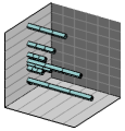
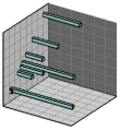
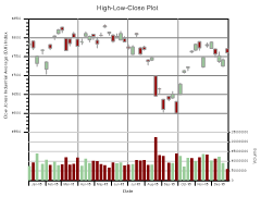
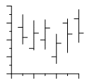
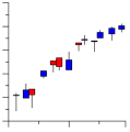
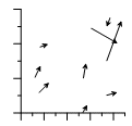
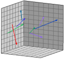
Specialty PlotsSpecialty plots include high-low-close plots, candlestick plots, 2D and 3D vector plots, and stiff plots. High-low-close and candlestick plots display at least three variables on two axes. Vector plots display four or six variables on two or three axes. Vectors can be displayed between two points (XYXY and XYZ-XYZ plot types) or from a starting point to another point (XYAM and XYZ-dx, dy, dz plot types). Stiff plots show concentrations, typically anion and cation concentrations in water. |
|
|
|
|
|
|
|
|
|
|
|
|
|
|
|
|
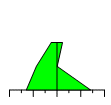
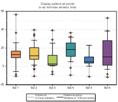
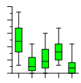
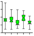
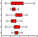
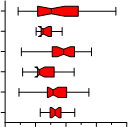
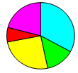
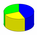
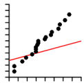
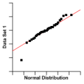
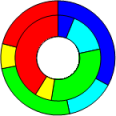
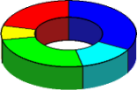
Statistical PlotsStatistical plots include 2D and 3D vertical and horizontal histograms, box-whisker plots, 2D and 3D pie charts, Q-Q plots, and 2D and 3D doughnut plots. Histograms read raw data and count the number of instances in each bin and then display the bin frequency as a bar. Pie charts display data as percentages of a whole. Doughnut plots are similar to pie charts, but can be stacked and have a hole in the center. Box-whisker plots and notched box-whisker plots display median, quartile, and outliers for a data set. Q-Q plots display a data set compared to another data set or to the normal distribution. |
|
|
|
|
|
|
|
|
|
|
|
|
|
|
|
|
|
|
|
|
|
|
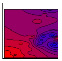
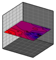
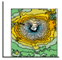
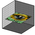
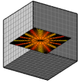
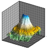
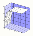
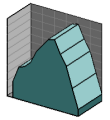
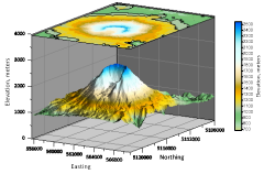
Contour Surface MapsContour maps include contour data maps, grid maps, and function maps. Contour maps are 2D representations of three variables. The contour line defines the equal Z values across the map. Contour maps can be displayed with an XY or XZ orientation. Surface Maps include surface data maps, grid maps, and function maps. Surface maps are 3D color representations of three variables. |
|
|
|
|
|
|
|
|
|
|
|
|