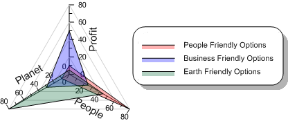
Radar Charts
A radar chart is a graphical method of displaying multivariate data in the form of a two-dimensional chart of three or more quantitative variables represented on axes starting from the same point. The relative position and angle of the axes is typically uninformative. The radar plot is also known as a spider chart, a web chart, a star plot, and an irregular polygon chart.

|
| A radar plot is used to display multivariate data. |
The radar chart is a chart and or plot, that consists of a sequence of equi-angular spokes, called radii, with each spoke representing one of the variables. The data length of a spoke is proportional to the magnitude of the variable for the data point relative to the maximum magnitude of the variable across all data points. A line is drawn connecting the data values for each spoke. The radar can be used to answer questions such as; What variables are dominant for a given observation? Which observations are most similar? Is there a cluster of observations? Are there outliers?
Radar charts are a useful way to display multivariate observations with an arbitrary number of variables. Each observation is represented as a star shaped figure with one ray for each variable. For a given observation, the length of each ray is made proportional to the size of that variable. Radar charts can be used to examine the relative values for a single data point and to locate similar points or dissimilar points.
Creating a New Radar Plot
To create a radar plot
- Click the Home | New Graph | Polar | Radar Chart command.
- Select a data file in the Open Worksheet dialog.
- Click the Open button. A radar plot is created with the default properties.
Radar plots will be created with the same line and symbol color for all plots when created from the Home | New Graph command. Create a radar plot from the Graph Wizard to automatically apply different colors to the plots.
Editing a Radar Plot
Radar plot display properties are controlled by selecting the radar plot. Unlike most plots, radar plots do not have a Plot page in the Property Manager. Properties such as the data file, included columns, and worksheet rows can be controlled by selecting the graph object and clicking the Graph page.
To change the features of a radar plot, first select the plot in the plot window or Object Manager and then edit its properties in the Property Manager.
Click the following tabs in the Property Manager to change different properties:
Editing a Radar Plot Graph
Some features of the radar plot are controlled by the graph object. To change these features, first select the graph in the plot window or Object Manager. Click the following tabs in the Property Manager to change different properties:
Radar Plot References
Chambers, John, William Cleveland, Beat Kleiner, and Paul Tukey, (1983). Graphical Methods for Data Analysis. Wadsworth. pp. 158-162
NIST/SEMATECH (2003). Star Plot in: e-Handbook of Statistical Methods. 6/01/2003
Mayr, Georg von (1877). Die Gesetzmäßigkeit im Gesellschaftsleben. Oldenbourg. p.78.
